Pet portraits in watercolours

Two posts in one day! That must be some kind of record for me…but that’s how I roll, feast or famine folks!

Lately I have been really getting back to one of my first artsy loves – watercolours. I have tried a new technique using a photo as a guide and sort of monochrome palette and that is very nice. You can see sweet Amelia’s portrait here. I also did this one of my pup, Sass, at the beach (well, the pic is from the beach, I did the portrait in my little studio!)

Sass wc

Next up is a bittersweet portrait of the adorable Chief. My daughter commissioned it as an “in memoriam” gift for friend who cherished Chief for 15 long years before having to make that difficult decision. RIP Chief.

RIP Chief

For this one, I expanded my colour range a bit. Next I am going to try a cat portrait and see how I do with that. If anyone is interested in a commission please comment on here, or private message me over on my facebook page – Made with Lafter.

Thanks for stopping in again, peoples. Hope you are having a very enjoyable Sunday!!

Pen Pal + scrapbooking + pocket pages = FUN!

So there’s this addictive new trend in papercrafting called Pocket Letters that I just stumbled upon the other day and I am HOOKED already! It’s a cross between penpalling and papercraft using the 9-pocket page protectors usually used in trading card collecting. Janette Lane, the creator of this fun new hobby, explains it much better here and elsewhere in her amazing, inspiring blog janettelane.blogspot.ca

You can connect with Pocket Letter pals from all over the world and swap pocket letters on a one-time basis, or strike up an ongoing exchange. There is a Facebook page and a website to facilitate these connections! How much fun is this? Too much fun, I say!!

Anyway, I am blogging today about my second pocket letter ever. My pal is in the Netherlands and we both have an interest in painting so we agreed this will be a handpainted theme. The idea is to fill the 9 pockets with various bits of scrapbooking art, little supplies and goodies and send it off with a nice letter tucked into one of the pockets. Imagine receiving happy mail from all over with other crafter’s creations and thoughts! I am all in. You can see my first PL here.

And here is my second one, front and back. The idea is that you can store your letters in a 3 ring binder, so I like for both sides of my letters to be decorative.

Will front Will back

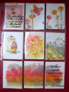
I decided that rather than do a full sheet picture and cut it into 9, I would do a triple pocket picture at the bottom, and then coordinating items for the other pockets. From the top left going around I did:

vellum overlay 
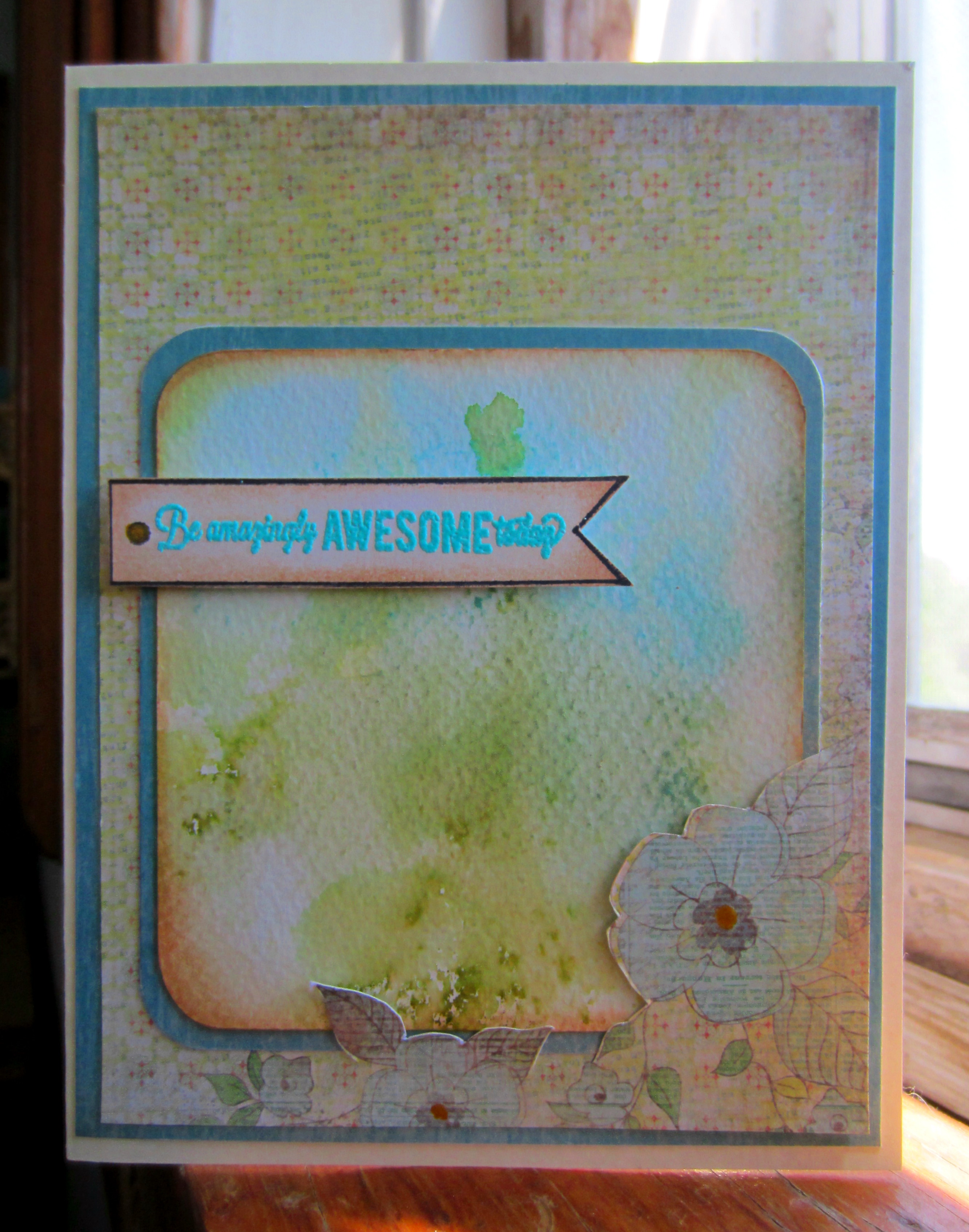
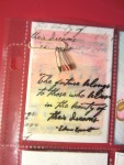
a vellum overlay stamped with a quote and attached to a handpainted background with a paperclip and tiny safety pins as decoration. Behind this pocket is patterned paper and I included some more coloured paperclips.

Next is a double pocket:

bloom double pocket
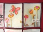
for this one, I embossed my design in gold and then painted with Distress inks to create the little scene. Behind this one is some handpainted tags and some stamped vellum diecut butterflies.

Middle row has this whimsical owl, (Unity stamp that I just love, I mean, how funky is she?)

handpainted owl
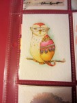
with washi tape samples behind

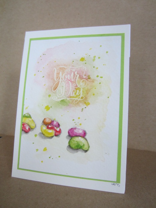
I didn’t photograph my centre pocket for some reason but you can see it in the full page pics. Used masking fluid in a fineline applicator to write “just a note” and then watercoloured around it before removed the fluid. Tucked in behind is my letter to my new friend.

Next is something I am pretty proud of:

magnet
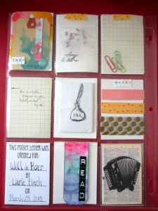
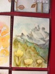
my pen pal told me she liked Switzerland and the mountains so I watercoloured this little picture of the Alps. It has a magnetic backing and I sealed the front with gel medium so it could be wiped off if needed. A little fridgie magnet so she can always recall the mountains! I hope she likes it! I am going to try and include a handpainted magnet in all my pocket letters (my first one had a watercolour of a little sleeping red cat that I did to look like the recipient’s furbaby!)

Finally (thanks for hanging in there with me on this verry long post!) there is the three pocket abstract sunset with a handlettered quote.

triple pocket quote

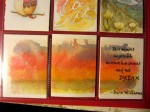
Behind this row is some handmade ephemera, a handpainted bookmark and my little “made for you” card.

So then I packaged it all up (if it’s happy mail I like it to be purdy too! 😉

off it goes

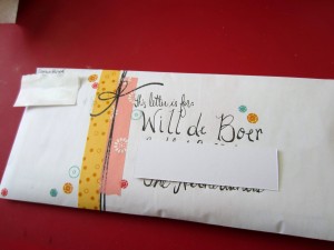
and off it goes to the Netherlands!!

If this new hobby catches your imagination, I encourage you to check out Janette’s blog, and look up Pocket Letters on Facebook and Youtube (it’s all over the place!) If you love it as much as I do, please feel free to comment on here and, if you like, we can swap letters!!


Sprinkle kindness, gather love.

Look at those eyes! (Masking Fluid Watercolour Technique)

amelia closeup

I have a very dear friend, the very best of friends actually, and she just became a grandma for the first time. She has the most adorable little granddaughter ever! (and I can say that because I don’t have any grandchildren yet, I might change my mind!, he he).

Anyway, back to the story, I saw this great picture of little Amelia and I knew it would be perfect for a technique I had been wanting to practice. amelia (Isn’t she just the sweetest? <3) 

I first saw the technique here and thought I would give it a shot. I did try it a couple of other times before this project, one I will show you a picture of later in the post, and the other was a commission and I forgot to take a picture of it before it went out the door to its new home. (oops. I do that ALL the time! not good with the camera.)

Again, I digress. So this technique utilizes masking fluid to keep your white areas white, and then a watercolour medium for the main part of the painting. It is done from a photo, so you have to choose your photo carefully…it works best with high contrast, clear photos, that don’t have too much going on in them. You digitally manipulate your photo to desaturate the colour and increase the contrast to near 100%. The blogger I linked to gave me some pretty clear instructions and then I just figured it out on the photoediting program I was using. I printed out the photo on plain paper.

Then I set up a makeshift light table using a plastic form I had already and my bright task lamp.amelia lightbox

I taped the printed photo to the lighttable and then taped a piece of 140lb Strathmore watercolour paper over top so that I could see the photo through it. (Yes, I know, it is not the pic of Amelia on my light table…work with me, folks!) Then I lightly traced the areas of light and dark out on my wc paper.  After removing the paper from the lighttable I used an OLD paintbrush to paint on masking fluid in the areas I wished to remain white.   Old because this stuff WILL NOT come off brushes easily or really, at all, even with the most rigorous scrubbing. (Don’t use your good brushes. You have been warned!)

Set this aside to dry for an hour or so.

amelia prep

While I waited for the masking fluid to dry, I mixed my watercolour. I used shades of blue-grey Inktense blocks and mixed up several varying strengths. Super easy,  just smoosh the block into the palette and add water. You can use a little grater on the block if you like.

amelia set up


Then with the photo as a guide, I used washes of colour to shade in the picture. Make sure you allow time between washes to dry or you will end up with a bit of a sodden mess. (*voice of experience*)

amelia wip

Finally, use an eraser or your fingernail to start removing the masking fluid “skin”. Once started it pulls off easily and voila! your watercolour masterpiece is revealed! A simple frame in a coordinating colour (thank you Great Canadian Dollar Store!) and my friend’s gift is complete.

amelia framed

Oh yeah, my other project with this technique…

IMG_2352

It is perfect for pet photos too! (my little Sass-monster! such a good girl)

So I hope you enjoyed this little photo tutorial and that you give this technique a try!


Kindness is the root of all good things

Jelly beans Art card

Hello everyone! My New Year’s resolution to blog once a week seems to have gone the way of most resolutions, lol!

Ah well, I am here now with some photos describing a card I made for a coworker’s daughter. He told me she is turning 14, loves jelly beans and the colours yellow and green, and is having a candy-themed birthday party. The rest was up to me!

I have been playing around a lot lately with watercolours and other watersoluble mediums so I thought I would go this route for this card. After I had completed the picture for the front of the card using Faber Castell watercolour pencils on Strathmore 140 lb paper, I really liked the way it turned out and thought, “now wouldn’t it be neat if she could save this picture, without having to save the whole card”…sort of, card as art.So I mounted the picture on some cardstock and then again on a 5×7 piece of watercolour paper so that it would fit into a standard size picture frame. Here is my little piece of art:


7 card art

To attach it to a card base, I took a 8 1/2 x 5 inch piece of heavy cardstock (100lb) and scored it on the long side at 7 inches.

2 base 1 start

I used repositional glue dots to attach the card art to the base.  I lined it up carefully to make sure the card would stand evenly.

4 closeup

3 attach base

So there we have it! A little piece of art in a card, that the young lady can save and frame if she decides to!!

6 Jellybeans for Genesis

Lots more to work on so I am going to head back to my art area..enjoy your day, my friends!!

Sprinkle kindness around like confetti!!

Just “messing” around!

MixedMediaBannerlarge

So I wanted to work on something for the Mixed Media Monthly challenge (this month is Stencils and Modelling Paste). Some of my favourite supplies to use, but the jury is still out on this one. I can’t tell if I have made art or just made a mess! haha that’s just the way it is sometimes I guess!

Working through some stressors at my job and not feeling the most effective right now and that’s what this page is all about. I have been fascinated with images and quotes from Alice In Wonderland lately, not sure what that is all about but I picked up the Spring Sprung Stampers Anonymous set the other day and the white rabbit stamp spoke to me!

day late dollar short


Also, I was going to print out and fussy cut a clock face and found some random paper in my stash to use. When I printed it, I noticed that the ink was beading on the surface so I flipped it over and use it as a transfer instead (right hand page, pretty much the centre). Kind of a neat accident, huh? Still don’t know what kind of paper it is, I found it in all my “junk” when I was helping my Mom move out of her house. I should really put it in a storage bag with a note about the transfer thing….

IMG_2003 IMG_2002 IMG_2001

Some closeups of the stenciling. Hmmph, still not sure..what do you think? Suggestions?

Other supplies include: Dylusions spray in fresh lime and vibrant turquoise, Mister Huey in amarillo taxi, Distress Paint in mustard seed and salty ocean, Liquitex modeling paste and gloss gel, Tim Holtz stencils Measured, Burlap, Splatters and Clockwork, some india ink by Daler-Rowney, Stampers Big Brush in black and white,  LSG Moon Shadow Mist in tawny turquoise and a cool little alphabet stamp set I got at Target.


The world is full of kind people; if you can’t find one, be one!


annd we’re back!

It’s been a crazy summer! My mother has given up her home and moved in with me and what a lot of work that is! 25 years in one spot and you accumulate a lot of stuff (and it makes matters worse when your children (myself included! use your house as a convenient storage site!!) Anyhow, we are on the downside of it now and she is getting settled in here so I found some time to do a little crafting.

This project is a 16 x 20 canvas for a dreary spot at work that needs some livening up. I originally did this canvas


Mixed media canvas using Faber-Castell's Whipped spackle tinted with Gelatos, some stenciling and stamping to finish. Pitt artist pen for quote.

but then it looked perfect on my living room wall so I couldn’t give it away! Oh boy, back to the drawing board!

So I promised myself that this one would go in to work with me FOR SURE and sat down to do some creating this past weekend.  Here’s the finished canvas and then I will show you some step-by-steps of my process.

 walk gently butterfly

First I gesso’ed the whole canvas, laid down strips of my patterned paper using gel medium to adhere them.

 step 1 step 2step 3


I gesso’ed again and also used some white acrylic paint to create a focal point.I used a couple of stencils and light Modeling Paste for the texture on the perimeter of the canvas, and also mixed distress ink and white acrylic paint to stamp some more texture in a light bluey/grey/green tone.

My previous canvas was a serene birch tree by pond scene and I knew I wanted another gentle scene from nature. I was inspired by a moment in my garden as a butterfly landed fleetingly on a coneflower. I tore strips of text and music paper to shape the wings and petals, and used Distress Inks and gelatos to colour them in. I was wracking my brains to figure out how to make the tracery on the butterfly wings when I remembered a texture stamp from Tattered Angels…perfect!

step 4 butterfly wings step 4B

I used Glass Bead Gel mixed with gelatos and india ink to create the middle of the flower and the butterfly’s body. I just love the texture that gave!!

close up finished canvas step 5 flowerstep8 writing

Finished the sentiment and butterfly details with Stampers Big Brush pen and smudged the edge of the canvas with Iced Coffee and Black Cherry gelato from the new Steampunk collection (love the metallic shimmer) which I had also used on the edges of the butterfly’s wings. What do you think? Have I captured that soft moment when a butterfly lands near you?

Thanks for visiting and don’t forget to walk gently, my friends!!


Supplies: Liquitex gel medium, modeling paste and Glass Beads texture gel, Daler and Rowney gesso,  DecoArt acrylics, FaberCastell gelatos and Stampers Big Brush pens, Tim Holtz Distress inks, My Minds Eye Lost&Found Two paper, Perfect Pearls spray – Biscotti

Distractions…

So I have been trying to clean, purge and reorganize my craft area. Not an easy task but that’s a story for another post.I was making some progress today when I got distracted by some little pieces I had leftover from another project and the next thing I know, I am sitting at my table making a card!

I made one of those “thinking of you/encouragement/you can do it!” sort of cards that you just need when you need it, y’know? so I do like to have a couple on hand, just in case. Fortuitously (you don’t get to use that word in everyday conversation very often!!) I had just impulse bought  picked up  a WeRMemoryKeepers Anthologie paper pack that was the perfect match for my little leftovers!

Anyhow, here it is:

awesome today

And I am back to cleaning/purging/organizing…oh wait, what’s that little stamped image?….


Supplies: Anthologie 6×6 paper, Momenta textured cardstock, Canson 140lb watercolour paper, ivory 5×7 cardbase, Unity stamp “You Did It”, Versamark ink and AC Zing embossing powder in Aqua, Distress ink in Crushed Olive, Tea Dye and Tumbled Glass, Distress Paint in Tarnished Brass.

when inspiration strikes…

WC_participant

I should be making Father’s Day cards to sell at work…working with navy and earth tones, images of ties, cars, graphic stripes and the like..but instead I am inspired to work with a palette of coral pinks and peaches, delicate flowers and wood veneers, and Perfect Pearls Mist!! If ever there is the opposite of masculine it must be the shimmery prettiness of Perfect Pearls.

emboss resist closeup

This card is made using the emboss resist technique I learned at the Watercolour for Cardmakers class. I used Distress markers to stain the wood birdcage and spritzed the flowers with the aforementioned Pearls mist in Biscotti. The background paper is from MME’s Lost&Found Two collection.

Mom 80

Oh well, you have to go with the flow and so I have my Mom’s 80th birthday card done over a month in advance!! I will try to be satisfied with a sense of accomplishment about that and ignore the upcoming deadline for Father’s Day!!

Off to bed, sleep tight my friends, tomorrow is another day!


~My religion is very simple, my religion is kindness. ~the Dalai Lama


More Watercolour for Cardmakers – Masking fluid

WC_participant

This will be quick because I love you guys but it is 22 and sunny out there and I am on a day off!! Dizzy with anticipation, I am! I think everyone, North America wide anyway, will agree it was a long dreary winter and I can’t wait to get out of hibernation and enjoy the good weather!

I am still working on some of the earlier techniques before I attempt the freehand stuff. This card was made by printing out a sentiment block from the internet (I didn’t have the stamp I wanted) and then using masking fluid to cover it over before layering on my watercolours. After the paint dries, you just peel off the masking “skin” and you are left with a lovely white background in the middle of your vibrant colour. Cool, huh?

Day 2 masking

Then I did a little splattering and dropletting (yupp, going with it, real word or not!) and adhered it to a 4.25×5.5 base in a coordinating colour. And c’est tout!

best dad ever

I’m out folks, that sunshine is calling me! Enjoy your day whatever it brings!


~Kindness can become its own motive. We are made kind by being kind. ~ Eric Hoffer

Day 5&6

WC_participant

whoa, falling behind at Watercolors for Cards but you know what? Not stressing because with my registration fee, I have full access to the lessons, videos and pdf’s even after the class has finished!! So I can go back at my leisure, refresh and review the techniques, and practice whenever works for me!

I needed a quick birthday card last weekend so I tried the misted Distress markers on a stamp. I combined it with some patterned paper on a kraft card base and added a twine bow for pizazz! Most of the techniques in this class lend themselves to quick cards – minimal effort, maximum wow factor-now that’s what I’m talkin’ about!!

Day 5 a

I tried Swarthup’s artistic stamp colouring technique next and..well, it needs work! I don’t have a lot of floral stamps, or outline stamps, so I think I will have to put on my thinking cap and figure out how to use my supplies with this technique because I just love the effect!

Here is my attempt:

Day 6

Finally, my mother’s day cards fundraiser went over so well, I have decided to try and do a few Father’s Day ones before the Relay on June 21. Here is the first one, using the emboss resist technique with broad swathes of watercolour as the background! I used a CTMH stamp from the Cloud Nine set, and a Unity sentiment stamp with some Authentique Seasons: Summer patterned paper. Distress Inks were used for the background in Walnut Stain, Faded Jeans and Scattered Straw. (PS I make most of my cards 5×7, I just like the bigger size!)

hip hip hooray

I hope everyone is enjoying this class, and my posts, as much as I am! Enjoy your day, people!


~If you can’t be kind, be quiet~

Previous Older Entries

Lulu Art

A place to share mixed media arty goodness!

CreativeKady

Art Journaling and Mixed Media

Heather Telford

cards, colour, paper and paint

The Cutting Garden Papercraft Studio

The Best Little Crop House In Town

My Thoughts Exactly Stamps

creative imaginings from Laurie...after.

The Stamping Boutique

creative imaginings from Laurie...after.

Unity Stamp Company

creative imaginings from Laurie...after.

simply me

creative imaginings from Laurie...after.